Investigating user behavior click by click

What can 50,000 clicks tell us about our customers? Turns out, a lot!
In just seven days, Assembled users clicked on our platform’s new date picker 50,000 times. And while it may be tempting to think of click rates as mere vanity metrics, Assembled’s UX team discovered that pairing click rates with other observations can help uncover the why behind them.
But first, context
The date picker was one of the first components our UX team added to its new internal component library (aptly named Assemblage). After a few months of development and beta testing, we made the date picker available to all customers in May of this year. The initial release was confined to reports in Assembled. The plan was to iterate on the date picker’s features based on user feedback before rolling it out to more areas of the app.
We gathered qualitative feedback from customers in the form of Zendesk tickets, Slack messages, and comments relayed by users’ designated Customer Success Managers. These helped us gauge first impressions about the new features.
Early feedback was both constructive and positive. Many customers commented on the date picker’s sleek design, and some requested specific improvements that they hoped to see in the future. That said, not every customer offers feedback; and for those that do, sometimes there’s not enough detail for us to act on.
That’s why we look to usage metrics — to help us read between the lines about our customers’ needs.
Reading between the numbers
We set up reports to track click interactions in the date picker. After its first seven days of general availability, there were enough interactions to draw preliminary conclusions about how the new date picker meets (or doesn’t meet) the needs of our users.
How do customers select date ranges?
There are three ways to change the selected date range using the date picker:
- Select a preset date range
- Specify custom start and end dates
- Jump forward or backward in time using the selected interval
The third option was initially available on less than half of Assembled reports when we first released the new date picker, and we aimed to maintain parity with the original date picker components we replaced on those pages. For the pages that have them, the buttons that shift to the previous or following date range (which we dubbed “date steppers”) can always be found to the right of the date picker. The other methods of selecting a date range are in an overlay that is toggled by clicking on the date picker input.

Given the popularity of these date steppers, we hypothesized that users would generally opt for the quickest method and select a date range before using more fine-tuned controls. This seemed like a reasonable premise for making the date steppers available on all Assembled reports by default. And with over 130,000 clicks recorded so far — compared to 8,700 for preset ranges and 56,000 for custom ranges — the date steppers are still the most popular avenue for changing the selected range.
What are the most useful preset date ranges?
We rolled out the new date picker with eight preset options in the following order:
- This week
- Last week
- Last 7 days
- Last 14 days
- This month
- Last month
- Last 30 days
- This quarter

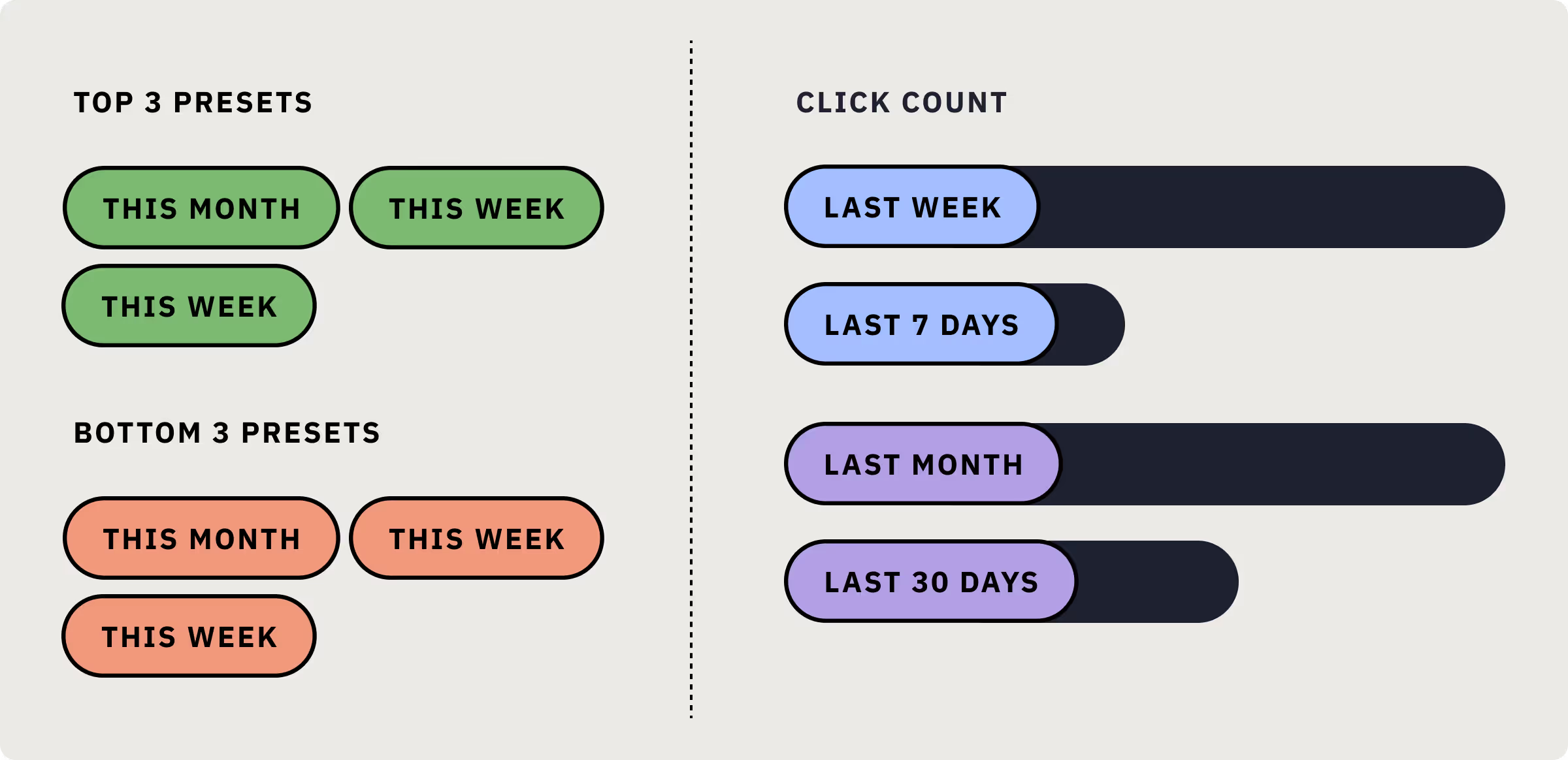
The top-three presets users clicked were This month, This week, and Last week, while the bottom three were Last 14 days, Last 30 days, and This quarter. Looking at the usage metrics more closely, we discovered Last week received three times more clicks than Last 7 days, and Last month got more than double the clicks when compared to Last 30 days.
This signaled a preference for presets that represent full calendar weeks or months instead of a specific number of days. In practical terms, if a user is viewing a report on July 5, they’ll find it more useful to view data from the entire month of June (Last month) instead of data from June 5 to July 5 (Last 30 days).
After observing this trend, we made two updates to the date picker’s preset ranges. First, we rearranged the presets so the ones that allowed users to select full calendar weeks or months would appear at the top of the list. Since these are the most frequently used options, they should be the easiest to access. Second, we added Last 2 weeks to the list of presets. To date, it’s attracted four times the clicks than the Last 14 days preset.
When do customers interact with the date picker?
While analyzing the click rates of the date picker’s presets, we found there were notable spikes in engagement on specific days of the week. Click rates tended to peak Mondays or Tuesdays — especially for presets that select dates from the previous week.
Similarly, Last month and Last 30 days peaked in usage at the start of the current month. This trend is especially true for reports that load with the current week selected by default, since they display only one or two days worth of data if they viewed at the beginning of the week.
It’s less apparent whether users are more likely to select custom ranges on certain days of the week or month. Usage rates for custom date range controls are fairly steady over the course of the week, peaking marginally at the end of the month. We may need more qualitative data to understand when customers prefer to select custom date ranges.
Since these observations came just seven days after the date picker was released, we made the decision to gather more data before making changes related to these patterns in user behavior. It’s important for us to confirm whether these early trends remain consistent over multiple weeks or months before we finalize what (if any) improvements to make.
Perhaps we’ll make Last week the default at the start of a new week — or Last month the default at the start of a new month — the standard for some pages in the app. Maybe we’ll exclude presets from pages in which they provide less value.
The moral of the story is still TBD — and it may require a sequel to solve.


